Last year I began to implement Pinterest in to my creative workflow after using it for a music video I made last year, so of course I'd be using it for this short film.
What You Watch Mood Board
As of writing this blog there's about 70 or so pins to the mood board. My goal with this pins to to nail down a general feel for how the film would look as well as and establish a tone. Many of the first few pins consist of images and graphic design art involving the human eye. Eyes are often said to be the window into the soul, but Eric isn't presented with one; I found the image of the girl with the clear reflection in her eye which made me think that the reflection can literally show the viewer that Eric's soul is just what he watches. I haphazardly took a test shot with my personal camera with an macro lens add-on and got a similar effect. To avoid the reflection of the camera lens, the scene where I'd capture a show like this would be very dark (with the only light source being the TV screen), so I could hide the lens among the dark background.
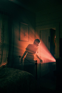
On the mood board I also saved lighting schemes that I can reference for my film. Being that for the scenes in the house there'd be 1 primary light source, I think it'd be fitting to light the film as if it were a noir. I could of course show the TV screen as the only source of light in a frame from the front to show the viewer what Eric sees, but I can also show how the TV is lighting the world around it. I could show the light rays coming from the TV to add some depth and texture to the frame, or I can maybe show what the screen is showing on Eric's face with the help of a projector. I think showing the light rays would help to create a sense of wonder and awe for Eric to be fully immersed with, while focused light on the subject may be useful to develop symbolism or irony.
Narrowing a piece of light onto the eyes like the first image below would be cool, but probably not super fitting for when the TV is on and fully immersing Eric. Instead I'd imagine a light setup like this begin used towards the end when Eric is panicking and shuffling away from the Host. Now when the thunder cuts the power and Eric is left alone, I would need to establish a window for there to be some motivated light in the scene. If there are blinds the lighting would be softer and more evenly spread out throughout the set like the third image. If there weren't any blinds, I could get away with using an harsh light source like a street lamp to motivate lighting just the subject like in the second image. I probably wouldn't want to include the light rays from above like in the photo, but the idea of backlighting Eric to create a shape of his figure without lighting distinguishing features like his face creates a mysterious and uncomfortable feeling.


As for ideas with the set, I already know I want to keep it fairly baren as another way to develop Eric's lack of character. If I film at my house (which I feel is very likely) I have tiled flooring that would work to reflect light and create some texture, similar to how the first image below does. I also feel as though I might lean towards making the shadows on the greener end of things to create a bit of a grimy look (maybe not to the extent of the image below, but the idea is still there).


No comments:
Post a Comment