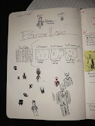
Thursday, March 10, 2022
Setting the Setting
Monday, March 7, 2022
Visual Comedy
Many filmmakers when they approach comedies, they mainly focus on the dialogue and performances. Granted that plays a big role in how the final film ends up, but when every other comedy focuses on the same thing, they all begin to feel same-y. Meanwhile Wright is thinking up how he could create visual comedy that adds to the story. This video from Every Frame a Painting, sums up many of the techniques that Wright used in his first few movies. He'd find ways to used blocking, movement, editing and auditory cues to highlight visual gags.
While visual comedy originated from early films to make up for their silent nature, it's more a else faded from modern filmmaking. That isn't to say the visual comedy has completely died off, it can still be seen in some films, but it's most commonly found in animated films. Hence why I've turned to Edgar Wright. A huge part about animation is how things move, so I'm kind of forced to include visual comedy in my opening. And no where is this most evident than in the second chunk.
Upstaging is a technique where something diverts attention from a subject. The impact lines, that zoom across the frame and foil the animator's ideas, upstage the frustrated animator. There was also an emphasis on how the failed ideas leave the frame, which was one of the points that was mention the video from Every Frame a Painting. But I felt there would be a disconnect if it was just the animation that had exaggerated movement, I want the character to have it too. It's had to show on paper, but I definitely plan on making sure each glance and movement is in time with the animation. I included this test video in a previous blog post, but I'm sharing it again since it's relevant. I also plan on including some visual comedy in the credit sequence like the credit track.
Another inspiration for this project from Wright has been his recent documentary, The Sparks Brothers. In this documentary, Wright choses to highlight the strange history of Sparks through interviews, archived footage, and animation. What better example than literally a directors that has mastered visual comedy and has using mix media to tell a story.
Sunday, March 6, 2022
Timing and Math (YAY)
Saturday, March 5, 2022
Who Did This????
Ah credits, often an overlooked aspect, but it's pretty cool seeing all the people that were involved in the making of a production. And it's also fun when you start to notice repeating names whenever you watch different movies. But let's to the meat of things. I've been thinking about the credit sequence and about which the order and such. Initially, I couldn't quite figure out the order, and I think that's in part to the fact that there were two parts that I could've put credits in. I could've had credits at the very beginning on a black screen with text as the frame is super zoomed into the ink of the pen on paper. And I knew for sure I wanted to include created in the fully digital portion of the opening after the sketchbook hits the wall. I began to think about how I could divide it, and which credits to include where. I kept switching around the order, but in the end I decided to make things simple and just have all the credits during the animated sequence.
Now all I have to figure out is the order. I watched a few openings and made an overall list that I can follow. I watched the opening credit sequences from the following movies:
For my opening, I'll start with the production company and cast members. Since I do plan on using music, I'll include the artist as the third credit. The next might be for character artists because I might collaborate with a friend to make another character design that I can include. If they end up making another character, I'd put the two of us as character designers. The last bunch of credits, editor, animator, cinematographer, producer, writer, and director, would be included in the credit track idea, so I can save time.
To help visualize the idea little bit, I made a test video with the idea for the credit track. The main thing that's missing in this video is text sliding over/camera tracking right. The text and background as well as aren't final since, the purpose behind the video was to both get a rhythm for the track and see if it's understandable. So far I think it looks cool would be more interesting than just fading in/out job positions while my name just stays there.
Friday, March 4, 2022
Time in Motion
My original idea for this infamous second chunk of the opening, was for it to be one long take in which the animation would come in. For the most part I still want to do that, but I need to think about how I could keep the frame interesting over the length of this part of the opening. One thing that's subtle, but can do a lot is gradually moving closer or further away. If I could I'd love to physically move the camera closer, but that'd be another moving factor in this mini stage play I'd have to do for this shot. I'll try it, but if its not working I'll probably just resort to filming the shot from a wide angle, and zoom in/out digitally in post.
Bo Burnham used digital zooms for much of Inside (2021)
I've also spent today making a test video for the timings list I made yesterday. Now listen, I'll be first to admit it doesn't look too clean, but that's okay. The main reason I made this video was to see whether the timings would work and if the flow wasn't too slow or too fast. It really just translates the list into a visual format that's easier to digest.
I myself like how it came out for the most part. There are some portions that seem a bit fast, but I'm taking the video with a grain of salt because the actual movement of elements weren't touched up. Typically in animation, things very rarely move at a constant/linear rate. Instead they often have smooth rate of change/interpolation. Besides a handful of moments, nearly every movement had linear interpolation. The final opening will have some form of smooth interpolation for most moving elements.
Thursday, March 3, 2022
Editing Before Filming
About a week ago I met with my instructor to talk about my current progression at the time. When I mentioned the idea of incorporating mix media/animation, she had asked about exactly how I was going to include it. I knew that I wanted to introduce the mix media in the 2nd chunk, I mentioned how it'd show to the viewer, what the animator is thinking, motion trails/visual exaggerations, and possibly some of the emotions the person is feeling. One of the early ideas I had for the opening was the animator throwing the sketch book at the wall out of rage. When I mentioned this, I was suggested that maybe something should come out of the sketch book and perhaps taunt the animator. I took that idea, but tweaked it a little bit.
It didn't take long for me to like the idea of the animation annoying the animator; it'd add another layer of frustration. During the initial suggestion, one of the first things I thought about was the very strange and dated Windmill scene from Army of Darkness (1992). The scene follows the protagonist Ash as he goes to rest in a windmill, but is harassed and attacked by tiny evil versions of himself. The scene it self is borderline a slap stick cartoon, which isn't what I'm pulling from it. I'm more just pulling the idea of something small creating that very much annoys the main character.
Windmill Scene - Army of Darkness (1992)
One of the first things I thought about was if something kept ruining the ideas the animator would come up with, but what? My answer came to me while thinking of an unrelated aspect of the opening. Throughout the first chunk, the animator is fidgeting with their pen by tapping on the page and impact lines coming from each tap. Each line would only travel a portion of the frame before fizzling out, during the last tap before the 2nd chunk, the impact lines would continue until their off screen. These lines will soon be responsible for much of the frustration soon to come.
The 2nd chunk to me, has been labelled the brainstorming phase because this is where the viewer will see all the different ideas the animator comes up with. Something I couldn't quite nail down was providing a reason for the animator to keep coming up with ideas. But now I have some lines that annoy the character. By putting two and two together, I came to the concept of the lines ruining each idea. This antagonizes the lines and provides a reason as to why the animator would want to throw their sketch book at them (and in turn the wall), as well as force the animator to come up with new ideas.
Wednesday, March 2, 2022
Designs and Inspirations
Hello I'm back, today I've been working on creating some of the character designs that will be incorporated in the brainstorming process and potentially in the main credit sequence. If I'm being fully honest this part stumped me. I knew what I wanted, but I kept over thinking certain aspects of the characters like clothes or proportions. To get around this mental hurdle, I redownloaded Pinterest.
I made a new board dedicated to the film opening. I searched through art aesthetics, surreal art, and illustrated designs to find some inspiration. It didn't take too long for me to find some unique pieces that I could jump off of.
Tuesday, March 1, 2022
Skipping Ahead
To start on the 2nd chunk I've been sketching out art styles and character designs that could be involved in the animator's brainstorming process. While working on this I came to the idea that some of these sketches both good and bad could be included in the main opening credit sequence towards the end of the opening. With this I took a break from working on the story board to think about how I could make the credit sequence. This portion has fully digital space that would include credits, names, and sketches to make the frame more interesting. Movies like Spider-Man: No Way Home and Mitchells vs The Machines both incorporate animation and mix media in their credit sequences to include all kinds of references and details. Doing this would creative a much more lively atmosphere and emphasis a tone for the rest of the film. Another fun aspect about these credit sequences like I said before is that I can include little Easter eggs or elements that foreshadow the story that is soon to come.
At the moment, I'm planning on making most of the animations with Blender Grease Pencil. While Blender is more known for its 3D animation, it is still possible to make 2D animations in the program. Something I want to avoid with this sequence is making it feel flat. For all the different colors and designs I can include, the final product can still feel simple. To avoid this I am planning on incorporating textures and grain so the frame feels tangible. I have a bit of experience with texturing objects, but I want to do more than just add an overlay effect.
Recently I've been watching Ben Marriott on YouTube; he's a motion graphics designer who makes tutorials for Adobe After Effects. He's made many videos about creating more engaging looks for animations and video. By following some of these videos, can not only make the animation textured, but also made the text of the credits fit with the look of everything else.
These are some of the video/elements I will watch and would like to incorporate in the final opening:
So far I've talked about what I can do in post to make the credits look nice, but I haven't really touched on the credit sequence itself. There are currently 2 ideas that are contenders. The first would go one credit at a time, while wipes of sketches or characters would be used to transition into different backgrounds. Think of how in the intro sequence the bubbles rising in SpongeBob would be used to transition from above the water to the front of his house. It's simple, but works to change background elements and color schemes.
Sunday, February 27, 2022
Storyboarding Session #1
Saturday, February 26, 2022
Initial Outline
Now that I feel pretty confident with a story idea, I should probably think of an outline for the film opening. The idea of an animator in a “writer’s block” while also showing their ideas to the viewer is ironic and something creatives may relate to. What I feel is important to remember is that this is only a small part of a much grander story.
To make planning this opening a bit simpler, I’d probably break up the 2 minutes into 1 minute or 30 seconds chunks. The goal with this opening is to focus on the struggle with putting thoughts on paper as well as establishing the aesthetics of the full piece. And after meeting with my instructor, I know that I can’t just have the character frustrated for the whole 2 minutes.
The first 30 seconds would likely establish that this character is an animator with the production design. I’m thinking the character’s room/studio could have papers with character designs, art styles, a workstation where final pieces are made, a calendar with a deadline, and the character with a sketchbook fidgeting with their pen. Within these 30 seconds we establish that this animator is on a deadline, and they’re struggling to make something.
During the next 30 second, the animation would begin to bleed through. It could start with motion streaks coming from the fidgeting pen and then it spirals out and linger in the frame for the rest of this portion. The animation serves both to show the character’s thoughts as well as their frustrations. The animations in this chunk would be the different ideas that come to the character, but towards the end of this chunk the character switches from idea to idea quicker and quicker. The different ideas begin to taunt and further frustrate the character until they reach a breaking point throwing the sketch book at the original spirals from the pen.
The 3rd chunk would begin with the sketchbook hitting the wall and an explosion of animation stemming from the impact. The explosion would fill the frame and serve as wipe to transition into fully digital space that would include some of the imagined ideas from before as well as different art styles. This portion would also provide a space for some of the opening credits. Towards the end of the I’d want to switch back to live action with a match cut. The ending would be a quick phone call where the main character is calling their boss to ask for an extension. Halfway through the word, it’d cut to a title card EXTENSION.
This outline isn’t concrete. Something might get moved around; the credits for example might get moved around because if it’s too long in that one chunk I might split it so that some are at the very beginning and then some are in the fully digital portion. Tomorrow I should have a more solid idea because I’m going to start my story board. Being that this opening focuses more on visuals than dialogue, by the time I’m finished I’ll have a good understanding of the timings and the overall flow of things. I’m also going to be sketching out possible character designs and art styles that could be incorporated in the final opening.Thursday, February 24, 2022
How People Use Mixed Media
In the past I've dabbled with mixed media, but only to an extent. My most recent project that included mixed media was for a music video I made back in October with two other students Isabella Chiappini and Luis Rodriguez. For the video we incorporated only a few bit of animation that we planned in advance.
| Sketch book page of what we wanted to include in the final music video |
It's been a while...
Hey yall! so I'm alive still and I'm gonna be blogging again in small doses, so I figured I'd start fresh. Here's the link t...
-
Hey yall! so I'm alive still and I'm gonna be blogging again in small doses, so I figured I'd start fresh. Here's the link t...
-
Finally the long waited sequel to My Interior Design Phase - Pt. 1. In the previous blog post I wrote about the big structural changes ...