
I did, I made an Instagram account for the film. It may not seem like much, but it took me a good bit to get to this point.
Yesterday my instructor gave a presentation about how to run a successful social media account and develop a brand. Up until this point my brand has based around some photos on my Pinterest Board and my usual harsh and vibrate lighting style, but I had actually designed as Key Art that could be used for developing a brand.
 |
Me + Michael - Music Video
Dir. Alex Duque |
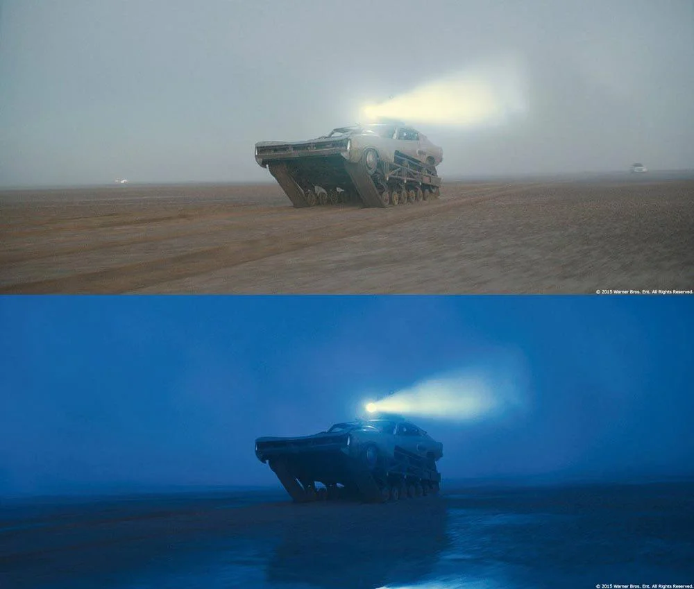
The first choice I made was deciding what would be the major colors associated with the brand. Initially, I thought about how I've never used greens before in my previous productions. I've seen the color be used to associate a griminess or to add a grounded feel to the story or certain locations; a green color grade has been repeatedly used in Amazon Prime's The Boys and even Disgust in Inside Out is a green color. I then began to think of the lighting from the TV, and I thought maybe using some blues would convey the technological aspects. Blue has also been used for color grading scenes to make well-lit scenes look like they were filmed at night.
 |
| The Boys |
 |
| Mad Max: Fury Road |
While the ideas were nice I turned on my inner designer to see if the two colors would work. Blue and Green on on the same side of the color wheel, so naturally there not much contrast between the two. I downloaded some stock log footage to tried and color grade a look. The very first problem I ran into was making the green and blue look like two separate colors and not just a teal-ish color. I had made the shadows have a green tint to them while the highlights would have a blue tint. Below I have the raw log footage on the left and the graded look on the right. The footage just looked like it wasn't white balanced. Ultimately I decided I would be best to ditch the greens as the blues had more in touch with the story than my want to try used green looks.
.00_01_12_15.Still001.jpg)
.00_01_25_21.Still003.jpg)


It's crazy how much a good night's rest can help because I woke up and immediately scrapped the previous project file, found a new static backdrop, adjusted a handful of a settings, added a texture to the text, and BAM that was it! The design was consistent with the brand's colors, detailed, and most importantly easy to read, but I had just remembered about how this logo is very much a horizontal logo with not much room for cropping to 1:1 aspect ratio for the Profile Picture. It was then that I referred back to one one my
initial sketches of a close up of an eye with a reflection.
I grabbed my camera, turned off all the lights in my room, shut the currents, put a flipped version of the logo on my phone, and got up right next to the camera. This decision also for the most part solidifies myself as Eric; this was a decision that I had been delaying to confirm since it would be nice to have a actor who would only have to focus on playing the role of Eric, but I've been focusing more of my time to look for a Host character and I've play role in my previous films before and I feel as though It wouldn't be that bad as long as I plan things out (which I will). I also was inspired by this short film where the main character was also the Writer, Director, Editor, and Producer. Anyhow, I took a few photos and combine the photo with the best framing with the photo that had the best reflection, and made this:
I really liked how it came out, so then I hopped over to Instagram made a new account and set it as the Profile Picture. I also added a brief Bio, introducing the production and teasing more to come. I'll be making the first official post this Friday and it'll be of the TV Logo (perhaps Photoshopped atop a TV Screen in a dark room to fit the tone and setting of the film. Anyways I'm glad I made the Instagram because it forced me to finalize a few decisions and move along in the project schedule.


.00_01_12_15.Still001.jpg)
.00_01_25_21.Still003.jpg)


No comments:
Post a Comment